



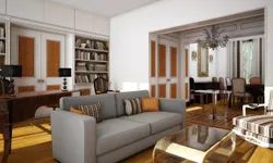
Fixtures don’t move. Walls stay put. Windows don’t shift. But the rest of the room? That’s where the real work begins.
Get the layout right and a living room breathes. Get it wrong and you’re tripping over coffee tables or hitting your hip on a kitchen island. It’s not just about aesthetics. It’s about survival.
Most homeowners obsess over paint colors or sofa fabrics. They ignore the skeleton of the room. The fixed points. The immovable objects. These are your anchors. Everything else must orbit around them.
Rhythm and Flow
Think of your home as a series of connected boxes. Some boxes have pipes running through them. Some have load-bearing beams. You can’t move the plumbing. You can’t shift the structural walls.
So what do you do with the empty space?
You create traffic patterns.
In a living room, the fireplace is usually the anchor. Your sofa faces it. Your chairs angle toward it. This creates a conversation pit. It feels intentional. It feels warm. But if you place a TV directly opposite the fireplace without considering sightlines, the room fractures.
In a kitchen, the sink, stove, and fridge form the work triangle. This is non-negotiable for efficiency. Move the fridge three feet left. Suddenly you’re taking ten steps between the fridge and the sink. That’s fatigue. That’s annoyance. That’s a bad design.
The Problem with “Open” Spaces
Open concept living sounds great in a magazine. In practice, it often means chaos.
Without walls to define zones, furniture arrangement becomes critical. You need to use rugs, lighting, and furniture orientation to create “rooms” within the room.
Place a rug under your seating area. Define the boundary. Use a pendant light over the dining table. Separate the kitchen from the living space vertically.
If you don’t define these zones, the room feels like a hallway. You walk through it. You don’t stay in it.
Traffic Flow: The Invisible Grid
People don’t just stand still. They move.
You need pathways. Clear pathways.
Standard walkways should be at least 36 inches wide. Ideally 42 inches. If you’re squeezing furniture into a tight space, measure the width of the door. Measure the width of the appliance. Measure the width of the person carrying the appliance through the door.
Most people forget the person part.
If your main walkway is less than 36 inches, you’re creating a bottleneck. Guests will bump into the sofa. You’ll spill drinks. The flow will feel cramped. It will feel hostile.
Function Dictates Form
Before you buy a single chair, map the room.
- Identify the fixed elements. Fireplaces. Windows. Doors. Radiators.
- Identify the primary function. Sleeping? Watching TV? Cooking? Entertaining?
- Draw the traffic paths. Where will people walk? Where will they not walk?
- Place the furniture that supports the function, anchored by the fixed elements.
If the room is for sleeping, the bed is the anchor. Keep paths clear around it.
If the room is for entertaining, the seating is the anchor. Create a circle. Ensure everyone can see each other
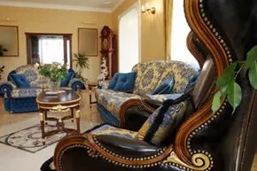
A good room layout lets people and pets move through without bumping into each other. Or things. Use human size as your baseline. Measure the space around kitchen islands, built-ins, and doorways. You need at least 42 to 48 inches of aisle width. That’s the rule of thumb. It can vary. Big rooms can handle more open space. Small bedrooms or sitting rooms need less, but don’t cramp the closets or desks. Save space on paper, lose it in reality. Convenience matters more than square footage here.
Mapping Traffic Patterns
Look at how people enter the room. Where do they go first? Check the heating and air conditioning controls. Locate the light switches. Find the electrical outlets. These are your anchors. They define the most logical path through the space. Use them to plan furniture placement. If the outlets are behind the sofa, move the sofa. If the thermostat is in the corner, don’t block it with a bookshelf.
Accounting for Moving Parts
Doors swing. Drawers slide. They take up space when in use. Recliners extend. They eat up floor space when someone is sitting in them. Dining chairs need room to be pulled out. Plan for this motion. Don’t just measure the object. Measure the object in action. If a chair needs two feet of clearance to slide back, give it two feet. Otherwise, you’ll be sitting on the floor or stuck between the chair and the wall.
Couch-to-Table Distance
Furniture placement affects flow. The distance from the front of a couch to a coffee table or hassock matters. You need enough room to get in and out. 18 inches is the minimum. It’s tight. Comfort matters. Use your best judgment. If you’re tall, or if you have long legs, give it more space. Otherwise, you’ll be scraping your shins every time you want a drink.
Create a Focus
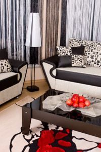
anchor your layout with a focal point
Stop guessing where the TV should go. In some rooms, the answer is obvious. A fireplace demands attention. A massive window begs to be framed. You just point the furniture at it and call it a day.
But what about the awkward nook? The boxy living room with no natural center?
Use art. Use a tall bookshelf. Use a dedicated desk corner. Pick one thing and build the rest of the room around it. It’s not just decoration. It’s structural.
carve out functional zones
Once you’ve picked your focal point, don’t just scatter chairs randomly. Group them. Make a conversation pit. Make a workspace.
Anchor these groups.
An area rug does heavy lifting here. It tells the brain, “Stop here.” Task lighting follows suit. A standing lamp in the corner of a reading nook defines the space better than any wall paint ever could.
In large, empty-box rooms, this is non-negotiable. Without these islands of interest, the space feels cavernous and cold. With them, it feels cozy. Intentional.
leverage existing architecture
Stop fighting the house. Start using it.
Windows aren’t just for light. They’re boundaries. Built-ins create natural shelves for storage without adding clutter. Bump-outs add square footage that begs to be utilized as a breakfast nook or a reading chair.
Even the bad stuff helps. That short wall? It limits traffic flow in a way that prevents accidents. That oddly angled corner? It’s a perfect spot for a custom desk or a rare plant collection.
Don’t smooth over the quirks. Highlight them.
balance scale and proportion
Harmony isn’t about matching everything perfectly. It’s about proportion.
A massive sectional in a studio apartment feels oppressive. A tiny loveseat in a sprawling family room feels insignificant. Match the furniture size to the room size.
Think about pathways. You need a minimum of 30 inches for comfortable walking. Maybe 36 inches if you’re moving furniture. Don’t skimp on clearance.
In small spaces, go vertical and light. Glass-topped tables reflect light. Petite sofas reduce visual weight.
In large spaces, don’t be afraid to scale up. A substantial sofa grounds the room. It prevents the space from feeling like a warehouse.
keep it safe and adaptable
Design is a work in progress. Your needs change. Kids grow. Remote work becomes permanent. Holiday entertaining requires extra seating.
Don’t lock yourself into a permanent layout if you don’t have to.
The most important rule? Safety.
Keep pathways clear. Secure heavy shelving. Ensure lighting is adequate for stairs and hallways. Function beats form every time. If you’re tripping over a throw pillow, you’ve failed.
Play with the layout. Move things around. See what sticks. The more you experiment, the better you’ll get at reading a room.
test it virtually first
Moving heavy sofas is exhausting. Dragging coffee tables across hardwood floors risks damage.
Try FloorPlanner BASIC before you buy. It’s free. It runs in your browser. You can drag and drop furniture, change wall colors, and see the layout from above.
It’s not just a time-saver. It’s a sanity-saver.
See if that rug fits. Check if the chair blocks the door. Get the big mistakes out of the way without lifting a finger.
next steps
You have the zones defined. You have the scale right. Now it’s about finishing touches.
Lighting layers. Texture choices. Personal artifacts.
The foundation is set. The rest is just details.